Something I think many if not all who tuned in to watch WWDC this year was how monumental the macOS segment really was. For a long time, with the rise of iOS and iOS being seen as the more ‘innovative’ OS, and getting the most attention, Big Sur was seen to many as a good but regular upgrade. There was focus on catalyst when it came to rumors, with there being a new Messages App and more, but that was really it. What we got, was far better.
Not only was the Catalyst project expanded to include the Messages app, which was an accurate rumor (thank goodness), the major monumental redesign and focus of Big Sur being a ‘Defining moment in the Mac history’, was nothing short of a shock.
I have been wanting to get my claws into Big Sur since seeing it, from a designer’s perspective, I was in love. After having it for a short time, and using it day-to-day, I thought I would break down the best parts for me about this first look.
The Design
Obviously, the design is the biggest visual change that you will see if you are Mac user updating to Big Sur. You will find that on the surface it looks like its a blown-up version of the iOS design we have all become accustomed too, but when you look closer there is more than meets the eye.

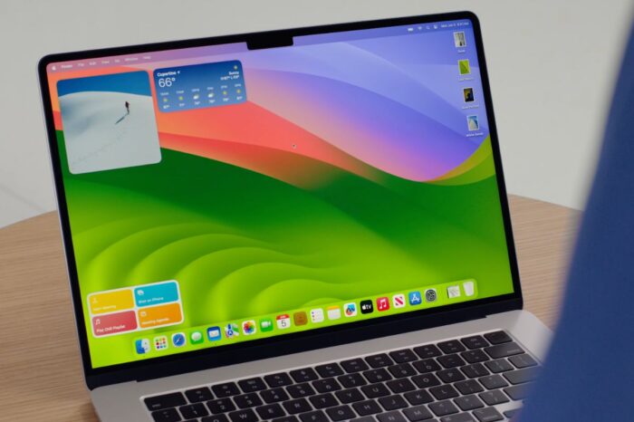
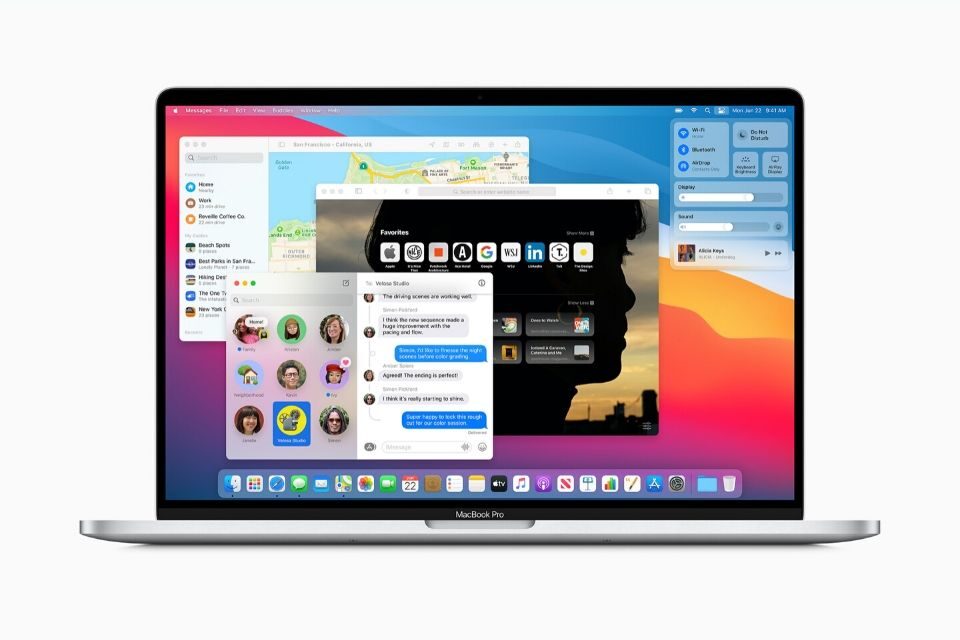
My macOS Big Sur Desktop. Familiar, but can you spot the differences?
The dock is floating with the same design as iOS and iPad OS, and the icons throughout the system use the same square as iOS, along with the new unified Apple Glyphs used throughout the system. The menu is translucent, but there is something else. Although many of the apps take on the iOS feel, many such as FaceTime, Messages, and more show something different. The return of drop shadows and gradients, 3D objects. Are we returning to Scheumorphism? Quick answer? No. But the new design we can see in Big Sur is based on a different design principle, Neumorphism. iOS 7 went from realistic objects in the OS, being made flat, but more and more we have seen shadows and 3D layering return after the release of iOS 10, and with iOS 14 and Big Sur, Apple has taken a big leap into the Neumorphism route. The buttons, the windows with their big curved edges, the buttons, the icons, and yes even that horrendously ugly battery icon in system preferences.
When using Big Sur, the design is radically different, and this brings me onto the second part of my review, and that is the move to number 11. After 19 years, macOS 10 is no more, and Big Sur brings in 11. Steve Jobs was right when he said OS X would set Apple up for the next 20 years! I always wondered what a system 11 would feel like from Apple, and Big Sur after a few days really does feel like an 11 system. It is familiar, with all the common things that macOS Catalina had, but the design and other elements like the new animations and App structure, make it feel so new.
I am running it on a MacBook with Retina Display, late 2013, 15 Inch. Its younger brother was made obsolete a few weeks ago, and this will be its last big update, so I was worried that Big Sur would render my computer feeling slow and bloated. However, in reality, it was the opposite effect. My machine feels new, although it turned 8 years old this year. Not to mention that this is the second beta, it is still so early in its development as macOS normally comes out a month after iOS to the public. So there is a long road of refinement ahead, but like my iOS 14 review, you can see Apple has focussed a lot on refining this system and their first batch of betas.
Messages and Catalyst
I love messaging from my Mac for the first time in a long time! Messages for me had always been the Achilles heel in macOS. The whole system would feel robust, smooth, and designed in such a way to ‘Just work’. But, as soon as I opened messages, it would often take a long time to open, then when it did open, it felt like a pirate copy of the real iMessage. But it wasn’t, and many others online would voice their annoyance about this issue too. Before Big Sur, iMessage on the Mac was a web view, without getting technical, the messages you see would be from a web view, not imbedded and rich like on iOS. So the normal bubbly animations you would get when yous scroll would be missing, the message effects wouldn’t work, and all the creative and fun stuff iOS had, was missing on the Mac.
However, Big Sur changed that. The old app has been thrown out in favor of a new one based off of the new Catalyst project, in its third year of development. The app is beautiful, it works and behaves the same as the phone, and runs like a dream even on my 8-year-old Mac. I enjoy messaging on it again, and often open it first before anything else, just to check messages!
Last but not least, Safari!
One of the main selling points that Apple took advantage of to show at WWDC was the amazing changes to Safari, and they were right too. Using it, it feels like a new browser. The stark white bar at the top maybe is a little too thick as there seems to be a lot of white space, but overall it feels like a refreshed browser. Apple says Safari on Big Sur is much faster than Chrome, a big statement but from using it does handle websites incredibly well. Most websites load within seconds and the experience is smooth and slick, something I have always loved about Safari. My computer also doesn’t feel bloated when using it. When using browsers such as Chrome, being an older Mac sometimes the fans go into overdrive over the amount of CPU and memory it uses just to run. However, with the new Safari, my laptop has been quiet, functioning really well, and loaded all websites with ease.
My overall thoughts on Big Sur are simple. For those who can upgrade to Big Sur, do so as it will make your machine regardless of age feel brand new. The new features and the switch to 11 really make this a groundbreaking update for the Mac, setting out a new path for the platform. If you cannot update and your Mac is too old for Big Sur, then if you can this is a great time to upgrade your Mac. Due to the impending switch to Apple Silicon and all the Macs in the lineup being updated within the last year (iMac we are still waiting!).