Last week, Apple unveiled iOS 13, the next big software update to roll out to iPhone and iPod this fall. iPad received its own OS for the first time, iTunes has officially died and watchOS can now help monitor your hearing health, and menstrual cycles.
However, I have been using iOS 13 this week, I want to break down how it has performed or/and changed the way I use my phone.
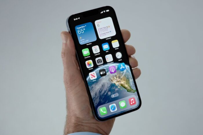
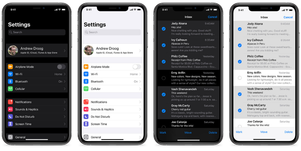
Dark Mode
Since installing, Dark Mode has been enabled ever since. It gives a completely new look and feel to iOS and somehow makes it feel a lot more feature rich of an OS than before. In some apps, Dark Mode is still quite new and has a few visual mistakes, but as new betas get rolled out before the September event, I am sure these will be fixed by Apple.
iOS 13 | The Apple Post
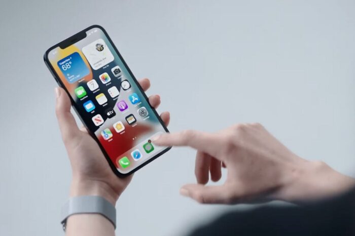
Of course, Dark Mode stops currently with Third Party apps, but it will be exciting seeing how different the stock apps feel, how this will change and work with Third Party applications.
Performance across the system
I have tried many new releases by Apple, and iOS 13 by far is the most stable and slick. There is no lag anywhere in the system. It has only stumbled a little when doing big actions within the Mail app, and exploring the Look Around feature for the first time crashed Maps, but these have only happened once and it hasn’t been a recurring issue.
The new Memojis’ work well, as well as Animojis’ too. The swipe to type feature works in a sleek manner and the whole system is just smoother and quicker to use.
One big thing I have seen however is Apple’s new direction when it comes to design. All windows within iOS now feel like cards. The share sheet when raised pushes the window behind it back a little, similar to the Music view when you select the Now Playing screen. All windows within Mail (Compose and Email Threads) have the same card design, and the Widget screen as you scroll, the Widgets when they hit the top instead of sliding up, push back like you are thumbing through a deck of cards.
It adds to the sleek feel of this new iOS and signals a pivot in the design of iOS in future updates.
Design and Look
All the new apps, such as Reminders which has received an end to end redesign, alongside Health which also received a huge redesign, have a new rounded Typography that is reminiscent with the new iOS 13 branding. Only these apps have it so again signals some changes in future updates.
All edit buttons are now a little circle with three dots in the middle, and all other utility buttons are circles or rounded buttons that do not stretch the entire screen, adding to this new bubbly, card style design.

Here’s how to enable Dark Mode on iPhone, and how to set schedules to allow iOS 13 to automatically enable and disable the appearance based on time.
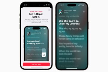
Possibly my favourite design change in iOS 13 is the Now Playing screen within the Music app. The entire app looks mostly the same as iOS 12, however, the playing screen has a much richer look. The artwork pops with Dark Mode, and the buttons have been rearranged in a much more logical way.
Lyrics and Up Next buttons are now within easy reach and makes the overall arrangement of the Up Next queue so much easier to manage and adjust.
Overall Review so far
iOS 13 currently stands as my favourite update to iOS ever. From the drastic changes with iPadOS, to the feature rich update heading to iOS, when you first download it you will find something new in every corner of the OS. It feels much more advanced, with desktop mail features now in the Mail app, from the new Reminders, the redesigned Health and new capabilities within Safari. iOS 13 is a powerhouse of speed, capability and features, that will most certainly improve the way you use your iPhone and iPod touch as soon as it comes to the public in the autumn!